| Beagle in Boots by Brett Neal Posted: 30 Oct 2011 10:30 PM PDT 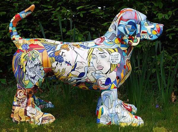 "I'm just a monkey with a paint brush. Put something in front of me and I paint it. I can only paint what I can see." That's Brett Neal, the artist who creates a history of art series by taking everyday ordinary objects and make them extraordinary. His witty fiberglass sculptures, such as this Beagle in Boots is to take the kitsch object to the point of art at the same time creating a diversion by placing the work of great masters on the object that is totally out of context to the paintings. Pondering the fine line between kitsch and art. 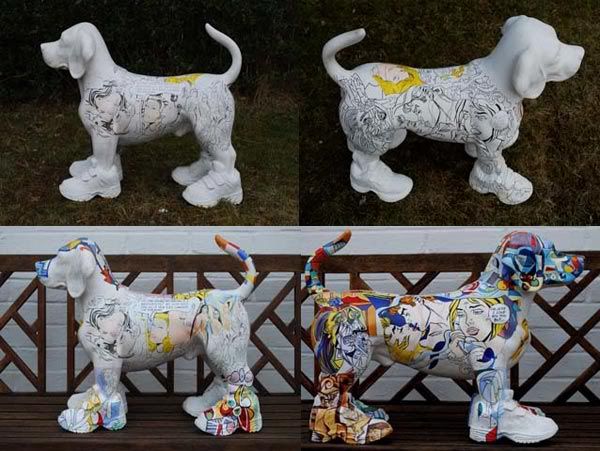 + Brett Neal
| Beagle in Boots by Brett Neal Posted: 30 Oct 2011 10:30 PM PDT "I'm just a monkey with a paint brush. Put something in front of me and I paint it. I can only paint what I can see." That's Brett Neal, the artist who creates a history of art series by taking everyday ordinary objects and make them extraordinary. His witty fiberglass sculptures, such as this Beagle in Boots is to take the kitsch object to the point of art at the same time creating a diversion by placing the work of great masters on the object that is totally out of context to the paintings. Pondering the fine line between kitsch and art. + Brett Neal
For Halloween, I felt like re-posting a piece that appeared here back in November 2009. To date, this tattoo is in my Top 10 that has appeared on Tattoosday. Enjoy! And have a safe, happy Halloween! I recently met a gentleman from England, along with his wife, as they were milling about outside of Madison Square Garden. He referred to himself as "Egghead," I'm guessing due to his bald head. I first noticed the logo for the band Slayer on the back of his calf, along with several other interesting looking tattoos. He estimated he has about a dozen tattoos. But, like the best Tattoosday stories, he shared this amazing tattoo on his right shoulder, hidden under a sweatshirt, which he pulled off so I could see it properly: That's a phenomenal piece, courtesy of his artist Ben Boston at The Tattoo Studio in Bristol, England.   The tattoo is a likeness of Eddie, mascot for the band Iron Maiden, one of the premiere metal bands that came out of England in the late 1970's/early 1980's. I won't bore the reader with the catalog of my Iron Maiden fandom, but it certainly made the tattoo even that more wonderful for me. I even had a nice chat with Egghead and his wife about concerts we had attended. I thank Egghead for sharing this awesome tattoo with us here on Tattoosday! This entry is ©2009, 2011 Tattoosday.
If you are reading this on another web site other than Tattoosday, without attribution, please note that it has been copied without the author's permission and is in violation of copyright laws. Please feel free to visit http://tattoosday.blogspot.com and read our original content. Please let me know if you saw this elsewhere so I contact the webmaster of the offending site and advise them of this violation in their Terms of Use Agreement.
I met Mary outside of Penn Station on Seventh Avenue a couple weeks ago. She shared this tattoo on her right calf: Mary explained: "I got my wolf tattoo at some place on St. Mark's Place, I don't remember, I was drunk, after I read [The] Call of the Wild. I had broken my foot and they let me leave work early, so I went to a bar with my best friend and started drinking. And then, I was like, 'We should get tattoos' and she was like 'I'm gonna go home' and then ... she was like 'I'm not gettin' tattooed'. So we went to some shady tattoo shop where they let me run around without shoes on and drink beer like a crazy girl. And all I remember is him asking me if I like lavender and I said, 'yeah, I like lavender' and that was that." Not your ideal tattoo story but, all things considered, this came out well. Thanks to Mary for sharing her cool tattoo with us here on Tattoosday! This entry is ©2011 Tattoosday.
If you are reading this on another web site other than Tattoosday, without attribution, please note that it has been copied without the author's permission and is in violation of copyright laws. Please feel free to visit http://tattoosday.blogspot.com and read our original content. Please let me know if you saw this elsewhere so I contact the webmaster of the offending site and advise them of this violation in their Terms of Use Agreement.
| Echo Cat & Dog Bowl Posted: 28 Oct 2011 06:32 PM PDT 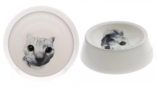 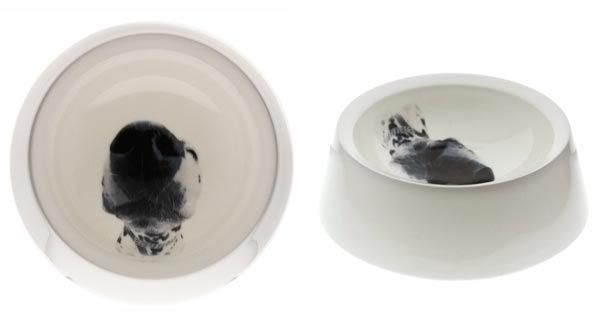 Spotted these super cute dog and cat bowl from Reiko Kaneko online shop. The Echo cat & dog bowl are made of fine bone china, and believe it or not, Reiko claims the pets apparently prefer the bowl. 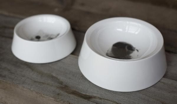 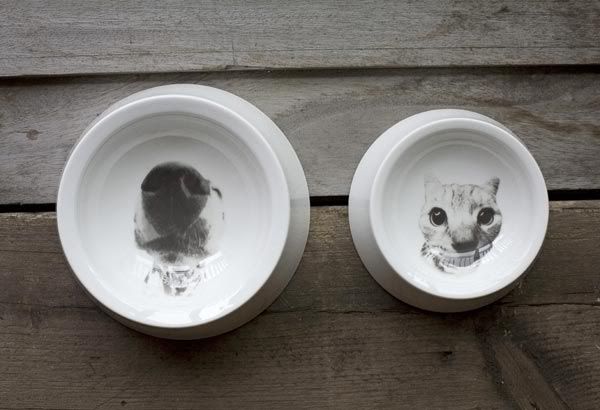 + Reiko Kaneko
| Echo Cat & Dog Bowl Posted: 28 Oct 2011 06:32 PM PDT Spotted these super cute dog and cat bowl from Reiko Kaneko online shop. The Echo cat & dog bowl are made of fine bone china, and believe it or not, Reiko claims the pets apparently prefer the bowl. + Reiko Kaneko
I met David last month at the Bay Ridge green market at 95th and 3rd. He shared this tattoo on his calf: David credited this, his first tattoo, to Tony at Citizen Ink on Avenue U in Brooklyn. "I just gave him the concept, and he drew it up," David told me, "A girl in a cape and a book." Thanks to David for sharing his first tattoo with us here on Tattoosday! This entry is ©2011 Tattoosday.
If you are reading this on another web site other than Tattoosday, without attribution, please note that it has been copied without the author's permission and is in violation of copyright laws. Please feel free to visit http://tattoosday.blogspot.com and read our original content. Please let me know if you saw this elsewhere so I contact the webmaster of the offending site and advise them of this violation in their Terms of Use Agreement.
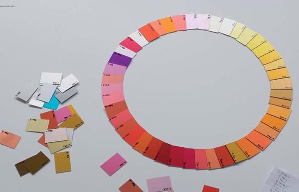
| Colour Trends For 2012 Posted: 27 Oct 2011 10:46 AM PDT 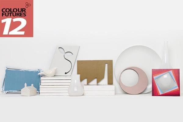 It's October now, and the world's largest paints company, AkzoNobel (Dulux) is releasing their Color Futures 2012, which present one dominant trend and five relating trends. The single color that best sums up the prevailing mood, attitude and fashion of the time is deemed the Color of the Year 2012. 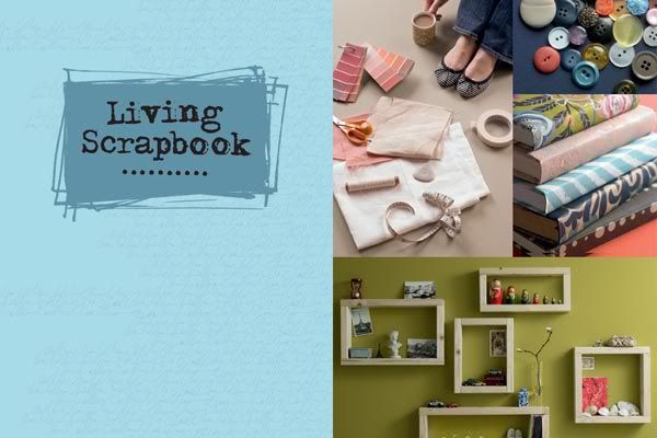 Trend 1: Living Scrapbook Trend 1: Living Scrapbook Our preoccupation with documenting and sharing our lives has become multi facetted with the likes of Facebook, Twitter, MySpace and a myriad of blogs all allowing you to invite people into your personal, self designed zone. This culture of showcasing 'who I am' has crossed over into the physical world and influenced how we present ourselves through our homes. This palette reflects the quirky aesthetics of blogs and social media. Happy, yet mature pastels beloved by designers like Ray and Charles Eames. This collection is modern but ever so slightly degraded and non-mainstream. 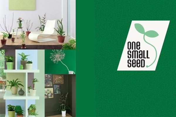 Trend 2: One Small Seed Trend 2: One Small Seed We can't save the world on our own, but we can enjoy the small wander of nurturing our own plants at home and creating new life from one small seed. Growing our own food helps us reconnect with the importance and delicate balance of nature. Plants are no longer simply decoration but a vital part of our interior environment. Nature inspires a palette of watery greens, fresh sky blue and earthy neutrals with deeper accents of dark soil, leaf green and bright pink and red blooms. Which one will you choose? 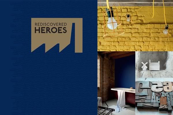 Trend 3: Rediscovered Heroes Trend 3: Rediscovered Heroes Hard times have their advantages; they prompt us to look around at what is already there and find new ways of using it. Abandoned buildings and discarded objects are re-invigorated and re-imagined to create useful and individual design. It's time to celebrate the humble lamp post, paperclip and milk bottle as heroes of design. This palette rejoices in the down to earth colors of our industrial heritage. Denim blue, rusty metal tones, concrete grey and sewing machine green are accented with signal brights inspired by the bold hues of wires and pipes. 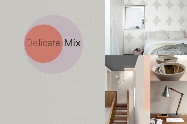 Trend 4: Delicate Mix Trend 4: Delicate Mix In times of turbulence we are attracted to design which offers silence and visual stillness. Very simple, beautifully made pieces are a real luxury and exude subtlety and refinement. A juxtaposition of materials creates the perfect balance and the smooth lines and polished surfaces demonstrate the love and care that has been taken to produce them. If you're feeling elegant and understated, these might be the colors for you. Refined neutrals, warm caramels, and blushing corals paired with polished concrete, wood tones and a hit of copper orange to add spice. 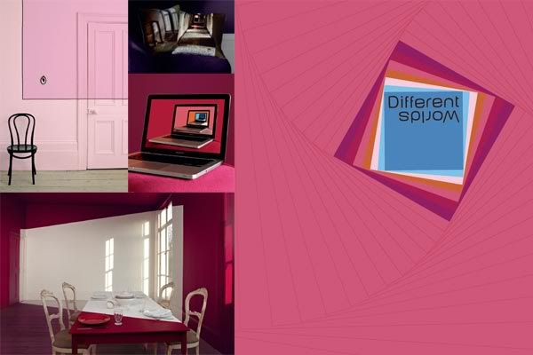 Trend 5: Different Worlds Trend 5: Different Worlds We have always been fascinated with the idea of exploring the line between fantasy and reality. Ever since Lewis Carroll's Alice dropped down the rabbits hole we have been enjoying weirder and more wonderful worlds and today's technology allows us to inhabit several worlds at the same time through gaming, Skyping and 3D movies This color palette is dreamy and surreal. Choose from lush blues, greens and reds or set your sights on a delicate, ethereal pastel. 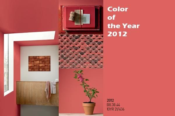 Color Of The Year Color Of The Year This radiant shade is the most important color for 2012 as it is at once whimsical and serious, dynamic and soft, perfect for a tiny accent or for a feature wall. Red is held in high regard around the world. In China, it is associated with good fortune; in India it signals marital bliss and insightfulness.
| Colour Trends For 2012 Posted: 27 Oct 2011 10:46 AM PDT It's October now, and the world's largest paints company, AkzoNobel (Dulux) is releasing their Color Futures 2012, which present one dominant trend and five relating trends. The single color that best sums up the prevailing mood, attitude and fashion of the time is deemed the Color of the Year 2012. Trend 1: Living Scrapbook Our preoccupation with documenting and sharing our lives has become multi facetted with the likes of Facebook, Twitter, MySpace and a myriad of blogs all allowing you to invite people into your personal, self designed zone. This culture of showcasing 'who I am' has crossed over into the physical world and influenced how we present ourselves through our homes. This palette reflects the quirky aesthetics of blogs and social media. Happy, yet mature pastels beloved by designers like Ray and Charles Eames. This collection is modern but ever so slightly degraded and non-mainstream. Trend 2: One Small Seed We can't save the world on our own, but we can enjoy the small wander of nurturing our own plants at home and creating new life from one small seed. Growing our own food helps us reconnect with the importance and delicate balance of nature. Plants are no longer simply decoration but a vital part of our interior environment. Nature inspires a palette of watery greens, fresh sky blue and earthy neutrals with deeper accents of dark soil, leaf green and bright pink and red blooms. Which one will you choose? Trend 3: Rediscovered Heroes Hard times have their advantages; they prompt us to look around at what is already there and find new ways of using it. Abandoned buildings and discarded objects are re-invigorated and re-imagined to create useful and individual design. It's time to celebrate the humble lamp post, paperclip and milk bottle as heroes of design. This palette rejoices in the down to earth colors of our industrial heritage. Denim blue, rusty metal tones, concrete grey and sewing machine green are accented with signal brights inspired by the bold hues of wires and pipes. Trend 4: Delicate Mix In times of turbulence we are attracted to design which offers silence and visual stillness. Very simple, beautifully made pieces are a real luxury and exude subtlety and refinement. A juxtaposition of materials creates the perfect balance and the smooth lines and polished surfaces demonstrate the love and care that has been taken to produce them. If you're feeling elegant and understated, these might be the colors for you. Refined neutrals, warm caramels, and blushing corals paired with polished concrete, wood tones and a hit of copper orange to add spice. Trend 5: Different Worlds We have always been fascinated with the idea of exploring the line between fantasy and reality. Ever since Lewis Carroll's Alice dropped down the rabbits hole we have been enjoying weirder and more wonderful worlds and today's technology allows us to inhabit several worlds at the same time through gaming, Skyping and 3D movies This color palette is dreamy and surreal. Choose from lush blues, greens and reds or set your sights on a delicate, ethereal pastel. Color Of The Year This radiant shade is the most important color for 2012 as it is at once whimsical and serious, dynamic and soft, perfect for a tiny accent or for a feature wall. Red is held in high regard around the world. In China, it is associated with good fortune; in India it signals marital bliss and insightfulness.
Dear Readers, Greetings on a rainy, gloomy day! I just have a quick correction to make (already made on the original post but it doesn't hurt to tell you now as well)—the link to writer Mary Beth Ellis on this previous post about Mira's List fans' residency experiences was wrong. The real website link should be this: http://www.blondechampagne.com in case you want to read more about Mary Beth. Sorry for the mistake. If any others would like to send me a couple photos from a residency they did in the last year or so, one they found on Mira's List, please send them to me as jpgs (no larger than 400 KB) and write a few words on what the place was like and what you did there. I need to know: 1. name of place and location (and link if you have it)2. your website link (if you have one and if you'd like me to link your name to it)3. whether or not you want me to post your full nameThanks! Mirabee
I met Collin back in August in the middle of Broadway, between 35th and 35th Streets, sitting at one of those tables that New York City had installed in the middle of the street. He had a lot of ink, and chose to share this section of his upper left arm: This piece, a snake with a gypsy head, circling an alarm clock, was done by Grez at Kings Avenue Tattoo in Manhattan on the Bowery. We promoted the shop opening back in May here. Collin explained the elements of this piece that curves around the arm: "The clock represents when I was born ... the candle's my life, burning, it's the time I have left ... gypsies are usually known to be good luck ... the snake is for the fucked up parts of my life and the gypsy head is for the good parts of my life, you know, the future." Collin explained that Grez initially was concerned about all of these elements combined into one piece. "At first he [Grez] thought it was going to be too much," Collin told me, "but it worked out and I'm happy with it." The clock is particularly remarkable: Grez's work has appeared on Tattoosday before, here and here. He's a great talent, and I'm always happy to stumble upon his work. Thanks to Colin for sharing this great tattoo with us here on Tattoosday! This entry is ©2011 Tattoosday.
If you are reading this on another web site other than Tattoosday, without attribution, please note that it has been copied without the author's permission and is in violation of copyright laws. Please feel free to visit http://tattoosday.blogspot.com and read our original content. Please let me know if you saw this elsewhere so I contact the webmaster of the offending site and advise them of this violation in their Terms of Use Agreement.
| The Design Work of Edward Barber and Jay Osgerby Posted: 26 Oct 2011 06:04 PM PDT 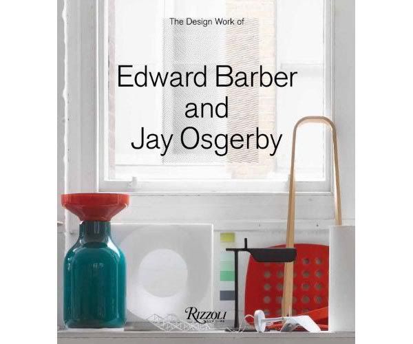 Internationally acclaimed designers Edward Barber and Jay Osgerby have their first monograph published by Rizzoli in New York.
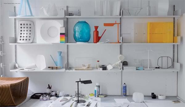
Britain two of the most most innovative industrial designers, the firm Barber Osgerby has won numerous awards since its founding in 1996. Distinguished by clean, modern lines, BarberOsgerby engages in furniture and product design, as well as consumer electronics, architecture, and interiors, making their mark with technical craftsmanship, formal vigor, and inspired use of color. BarberOsgerby's work includes iconic designs like the best-selling Tab Lamp (2008), and is part of permanent museum collections worldwide. Their portfolio ranges widely from accessible work to custom one-off pieces, including pews for a cathedral, hangers for Levi's, and the brilliantly hued Iris Tables. Their work has been produced by manufacturers and clients such as Cappellini, Swarovski, Stella McCartney, and Coca-Cola. Featuring sketches, concept renderings, and compelling photographs, the book is organized thematically with an emphasis on materials and process, tracing the inspirations and working method of this unique design duo.
   + Barber Osgerby
| The Design Work of Edward Barber and Jay Osgerby Posted: 26 Oct 2011 06:04 PM PDT Internationally acclaimed designers Edward Barber and Jay Osgerby have their first monograph published by Rizzoli in New York.
Britain two of the most most innovative industrial designers, the firm Barber Osgerby has won numerous awards since its founding in 1996. Distinguished by clean, modern lines, BarberOsgerby engages in furniture and product design, as well as consumer electronics, architecture, and interiors, making their mark with technical craftsmanship, formal vigor, and inspired use of color. BarberOsgerby's work includes iconic designs like the best-selling Tab Lamp (2008), and is part of permanent museum collections worldwide. Their portfolio ranges widely from accessible work to custom one-off pieces, including pews for a cathedral, hangers for Levi's, and the brilliantly hued Iris Tables. Their work has been produced by manufacturers and clients such as Cappellini, Swarovski, Stella McCartney, and Coca-Cola. Featuring sketches, concept renderings, and compelling photographs, the book is organized thematically with an emphasis on materials and process, tracing the inspirations and working method of this unique design duo.
+ Barber Osgerby
Hey there...thinking a lot lately about the need for more emergency grants in this downward economy! Don't forget to check out my sidebar on the right for more links to organizations that help artists and writers in need. Here is one for today...love y'all,Mirabeep.s. if any of you are local, i.e. living in Western Massachusetts, my very last local event is tomorrow, Thursday, October 27th, at Greenfield Community College in the library. It's at 4 pm and is the Writer's Harvest benefit for the GCC Food Pantry. Hope to see some of you there! xox
(ARTISTS & PERFORMING ARTISTS) Foundation for Contemporary Arts Emergency Grants—Created in 1993, Emergency Grants provides speedy funding for visual and performing artists who have unanticipated, sudden opportunities to present their work to the public, or who incur unexpected or unbudgeted expenses for projects close to completion with committed exhibition or performance dates. The grants are intended to support the creation of innovative and experimental work, and are meant to assist individuals and groups when there is insufficient time to seek other sources of funding. Requests are primarily granted to artists who are "emerging" and have few sources of financial support. Emergency Grants is the only active, multi-disciplinary program that offers immediate assistance of this kind to artists working anywhere in the United States. Emergency Grants applications are accepted year round; there is no deadline. There is no application form; please check the website for application requirements. Grants are determined on a monthly basis by the Emergency Grants Panel, a volunteer committee of established artists. In 2010, grants ranged in amount from $200 to $2,000; the average grant was $900. Special funds for travel to Asia, Central Europe and Eastern Europe: In addition to providing support for artists with immediate needs related to performing and exhibition opportunities, FCA has special funds for last-minute or unexpected travel or other expenses for US-based artists presenting work throughout Asia, Central Europe and Eastern Europe. Such requests must meet general Emergency Grants program guidelines in order to be eligible. http://www.foundationforcontemporaryarts.org/grant_programs/immediate_needs.html
| Albuquerque International Balloon Fiesta Sets New World Record? Posted: 25 Oct 2011 09:47 AM PDT 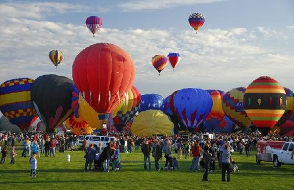 The 40th Annual Albuquerque International Balloon Fiesta lifted off from 1st October till 9th October in Albuquerque, New Mexico as hundreds of balloons sailed into the crisp autumn air. The festival is expected to attract 800,000 balloon enthusiasts from all over the world to the 365-acre Balloon Fiesta Park. 555 balloons and 600 pilots from worldwide are registered for the nine-days event.
For the first day, the fiesta has set the world record for most balloons launched in one hour, sending 345 hot air balloons into the sky from Balloon Fiesta Park. Albuquerque International Balloon Fiesta, Inc. is seeking the world record for the greatest mass hot air balloon ascent in one hour from Guinness World Records.
Earlier this year, the 12th Lorraine World Air Balloon Festival in Chambley-Bussieres, France launched 343 hot air balloons in one hour. 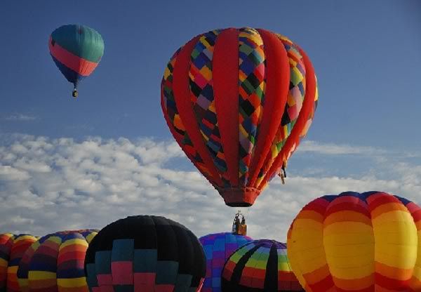 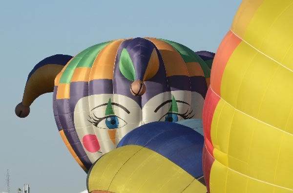 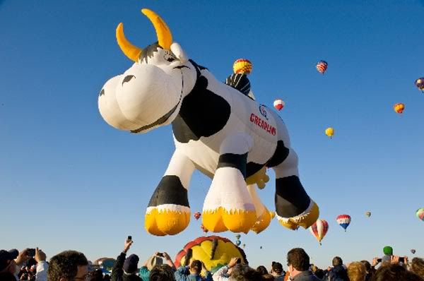 + Balloon Fiesta
| | | | | | | | |


